
Content has been reconstructed based on interviews with stakeholders and historical records,
and may include partial dramatization for better understanding.

Back in 1953,
Kia’s very first logo wasn’t just a symbol—
it was a glimpse into the company’s bold vision of
industrializing Korea and reaching the world.1
The logo, with the Kia lettering encased by
a triangle, gear, and benzene ring, represented
Kia’s vision of rising from Asia’s mechanical roots
and going global.
The triangle represented a drafting tool,
while the gear and benzene ring symbolized
the mechanical and chemical industries, respectively.
This logo marked the dawn of Korea’s industrial era.
Displayed on products like 3000-liho (Samchully),
it was the first face of Kia—
a symbol of Kia’s role in Korea’s very first steps
toward industrialization.
1) The idea of contributing to the nation and people through the promotion of mechanical industry

The second iteration of Kia’s logo
reflects the company’s identity
as it evolved into an automobile manufacturer.
Created through an internal competition
to mark the company's 20th anniversary,
this logo emerged from feedback
that the previous logo was too complex
and didn't align with the automotive industry.
The design, combining the Korean letters ‘ㄱ’ and ‘ㅇ’,
carries deep meaning within its simplicity.
The ‘ㄱ’ symbolizes Kia’s founding principle, ‘기(起)’,
meaning to rise or begin,
while the ‘ㅇ’ represents both the letter ‘아(亞)’
for Asia and the wheel of a car.
During the time when Kia produced
its first three-wheeled vehicle (K-360)
and two-wheeled motorcycle (C-100),
the logo design visually represented Kia’s products
by intuitively capturing the wheels of these vehicles,
as well as the front wheel and fork of a bicycle.
This clear and simple logo encapsulated
Kia’s identity and vision,
accompanying the brand on its 22-year journey
toward becoming an established automobile manufacturer.

In 1986, Kia introduced a new logo,
once again based on the English name ‘Kia’—
just like the original one.
Above the word ‘Kia,’ a flag with three flowing
curves symbolized Kia’s ambition.
This unique design was often affectionately
called the "chimney emblem"
by automotive enthusiasts,
as it resembled smoke rising from a chimney.
However, the three-curved flag was more than
just a design element—
it represented Kia's aspiration to grow into
a global automotive powerhouse.
As a symbol of Kia’s bold dreams
for a prosperous future and its relentless
drive for progress, the flag embodied
the spirit of Kia’s determination to lead
the automotive industry through
innovation and relentless research.

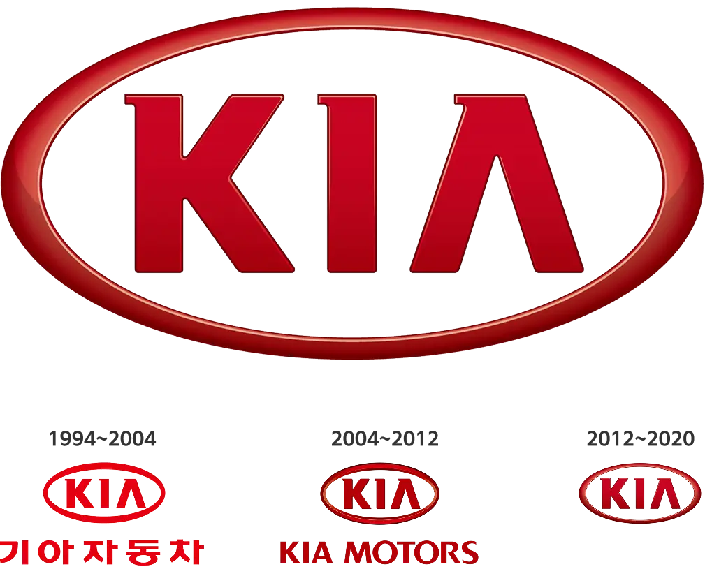
In 1994, Kia introduced a new logo
that further reinforced its identity
as a global brand.
At the time, with models like Sephia and Sportage
leading the way, Kia was preparing for
a full-fledged entry into the global market.
The new logo was designed to embody
Kia's bold vision of becoming one of the world’s
top 10 automotive companies.
The most striking change was the color.
The bold shift from the original blue watermark
to a vibrant red was a daring decision for its time.
While most domestic car brands
were using shades of blue,
Kia chose red, creating a distinctive identity.
This red oval logo became a symbol
that etched Kia into the minds of
global consumers for the next quarter of a century.

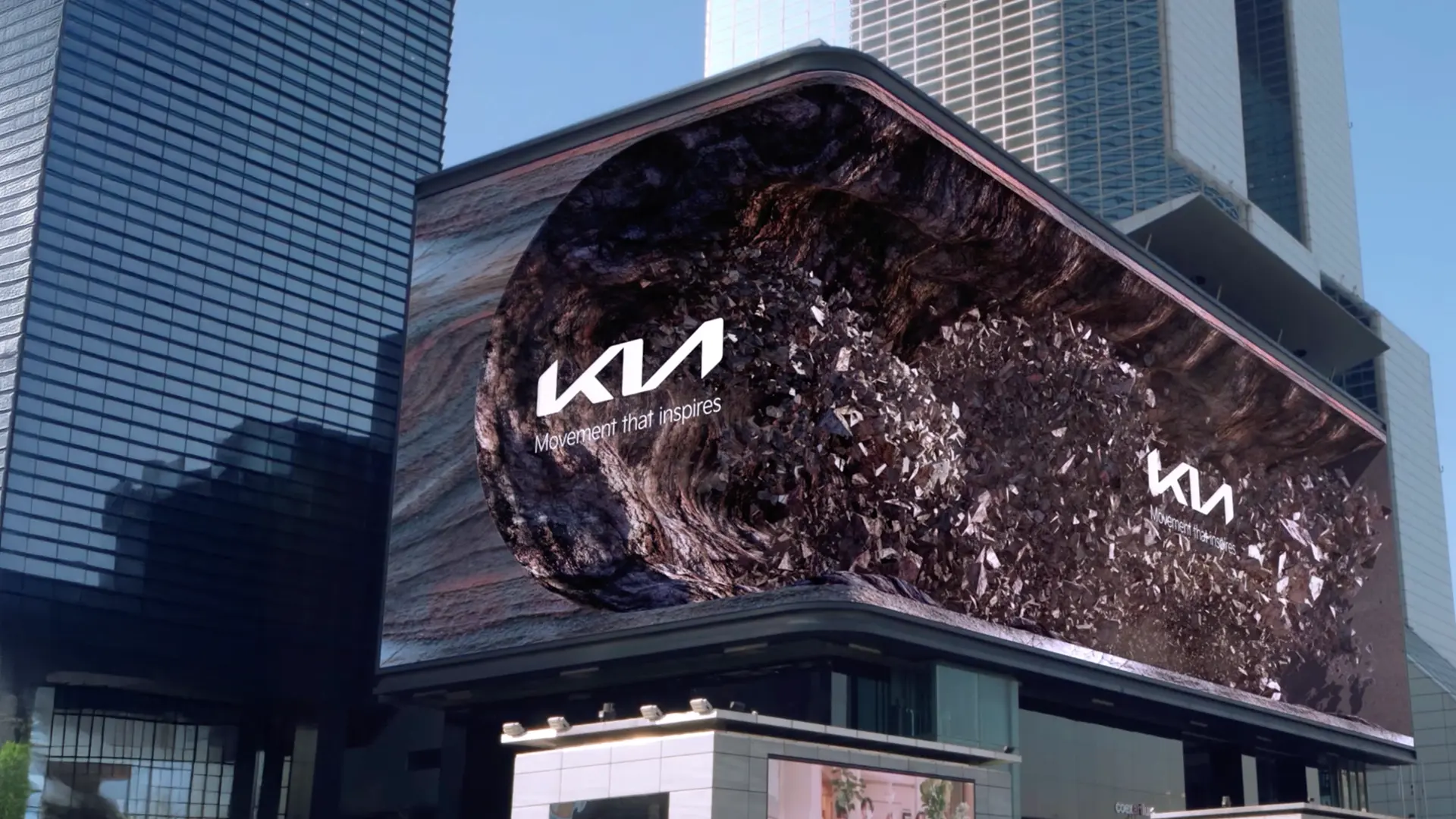
In 2021, Kia unveiled a new logo symbolizing
Kia's evolution from a car manufacturer
to a forward-thinking
sustainable mobility solutions provider.
The bold shift from the previous
oval design to the new logo represents
the attributes of balance, rhythm, and progress.
It reflects Kia’s commitment to moving beyond
the automotive industry, offering customers
not just cars, but new experiences and inspiration.
As Kia redefines its corporate identity,
this logo clearly communicates its vision
to be a technological leader
in an ever-changing mobility landscape.
More than just a new face for Kia,
this logo serves as a visual declaration
of Kia’s bold vision and commitment
to the future of mobility.
